
Telerik UI for .NET MAUI
What's New 2024 Q2
What's New HistoryWhat's New 2024 Q2
What's New HistoryTelerik UI for .NET MAUI AIPrompt: Blending AI with UI
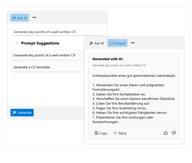
The AI Prompt allows you to align digital experiences with natural human behavior. Devised to streamline the integration of your favorite GenAI services into your Telerik UI for .NET MAUI applications, this new component sends prompts and then maps the response.
The Telerik UI for .NET MAUI AI Prompt is focused on providing users with a modern interface to interact with AI services, while enhancing usability for developers by offering smooth customization. It enables three predefined views to interact with: Prompt, Output and Command, each featuring specific functionality.
Effortless customization is also available. From configuring the button design to playing with the layout and footer template, you can adjust any AI Prompt feature to suit your needs. The AI Prompt component now features the following functionalities:
- Views – different views to enable users to have more control over when interacting with the control.
- Suggestions – typing is facilitated by population of suggestions.
- AIPrompt button – AIPrompt can be displayed as a button for easy interaction.
- Commands – custom commands with custom actions can be displayed within Commands View.
- Styling API – a set of styling opportunities is available.
- Localization – built-in localization support.
New Component: .NET MAUI CollectionView
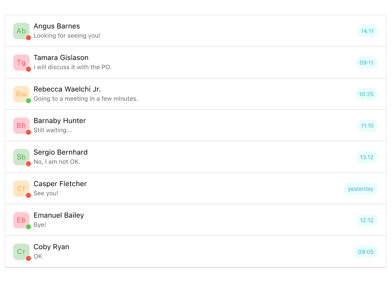
Telerik .NET MAUI CollectionView is a dynamic view component designed for efficient handling of lists of items, offering essential features commonly needed in such scenarios. This component empowers developers to filter, sort and group items as per your requirements. Additionally, it provides a flexible styling API and customizable templates, enabling developers to tailor the appearance and behavior according to their preferences. The CollectionView component now features the following functionalities:
- Selection – supports both single and multiple selections.
- Data binding – uses path property to support data binding.
- Item appearance – facilitates change in appearance of items.
- Different orientation – allows vertical and horizontal scroll.
- Grouping – a variety of grouping options are available.
- Group headers – a default group header that could be easily customized.
- Sorting – simplifies sorting of data based on user’s criteria.
- Filtering – fast filtering by using DelegateFilterDescriptor.
- Events – supports events that are called out when scrolling, tapping, etc.
- Programmatic scrolling – using API for easy scrolling.
- Style properties – facilitates styling and customization of CollectionView items and groups.
- Empty template – while the collection is empty, users can specify a template.
- Commands support – exposes commands to be executed with tapping.
New Component: .NET MAUI TemplatedButton
The Telerik UI for .NET MAUI TemplatedButton control serves as a dynamic tool for developers seeking customizable button functionality. Its adaptability extends beyond conventional button structures, allowing precise content alignment, integration of bespoke templates and seamless application of visual states. A notable illustration of its flexibility lies in the creation of loading buttons, effortlessly implemented through the TemplatedButton's features. The TemplatedButton component now features the following functionalities:
- Content and content template – simplifies the definition of content and setting ContentTemplate.
- Text alignment – allows horizontal and vertical position of texts.
- Visual assets – a set of changeable visual states is available like Normal, Pressed, etc.
- Exhaustive number of events – facilitates various operations on user interactions like click, press, etc.
- Command - exposes commands to be executed with tapping.
- Styling – easy application of styling options such as changing button’s background, border color and more.
New Component: .NET MAUI ToggleButton
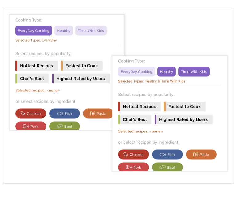
The Telerik .NET MAUI ToggleButton offers a straightforward solution for implementing toggling functionality within .NET MAUI applications. Its primary function revolves around facilitating user interactions by enabling the selection or toggling of options or states within the application's interface. Widely adopted in various scenarios, the ToggleButton is particularly instrumental in capturing binary choices, whether it involves activating or deactivating features, toggling settings or seamlessly transitioning between different modes or views. The ToggleButton component now features the following functionalities:
- Toggled states – facilitates setting of toggled and untoggled states.
- Content and content template - simplifies the definition of content and setting ContentTemplate.
- Text alignment - allows horizontal and vertical position of texts.
- Visual states - a set of changeable visual states is available like Normal, Pressed, etc.
- Exhaustive number of events - facilitates various operations on user interactions like click, press, etc.
- Command - exposes commands to be executed when the button is pressed/clicked.
- Styling - easy application of styling options such as changing button’s background, border color and more.
Grid upgrade: New DataGrid SKIAColumn
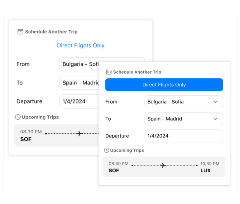
The New DataGrid SKIAColumn in .NET MAUI enhances rendering capabilities, providing smoother and more efficient data presentation. See more info here.
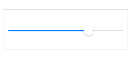
New Component: .NET MAUI Slider
With the 2024 Q1 release, the .NET MAUI component suite has a new member – Slider. It displays a value in a predefined min-max range allowing end users to change it by dragging a thumb along a range track.
The Slider brings an engaging and interactive navigation experience into your .NET MAUI application thanks to a set of built-in features:
- Value thumb – Used to modify the selected value.
- Range track – A customizable track that helps to better represent the selected value.
- Backtrack – The backtrack represents all the values that users can choose from.
- Ticks – Help users to easily identify the min-max range.
- Labels – Provide additional information about the underlying min-max range.
- Tooltip – Help users choose the desired value with better precision.
- Templates – Let you further customize the look of the control and its elements.
- Flexible styling API – Configure the look of your Slider component according to your preference.
See the .NET MAUI Slider documentation: Overview
.NET MAUI DataGrid Enhancement: Search as You Type
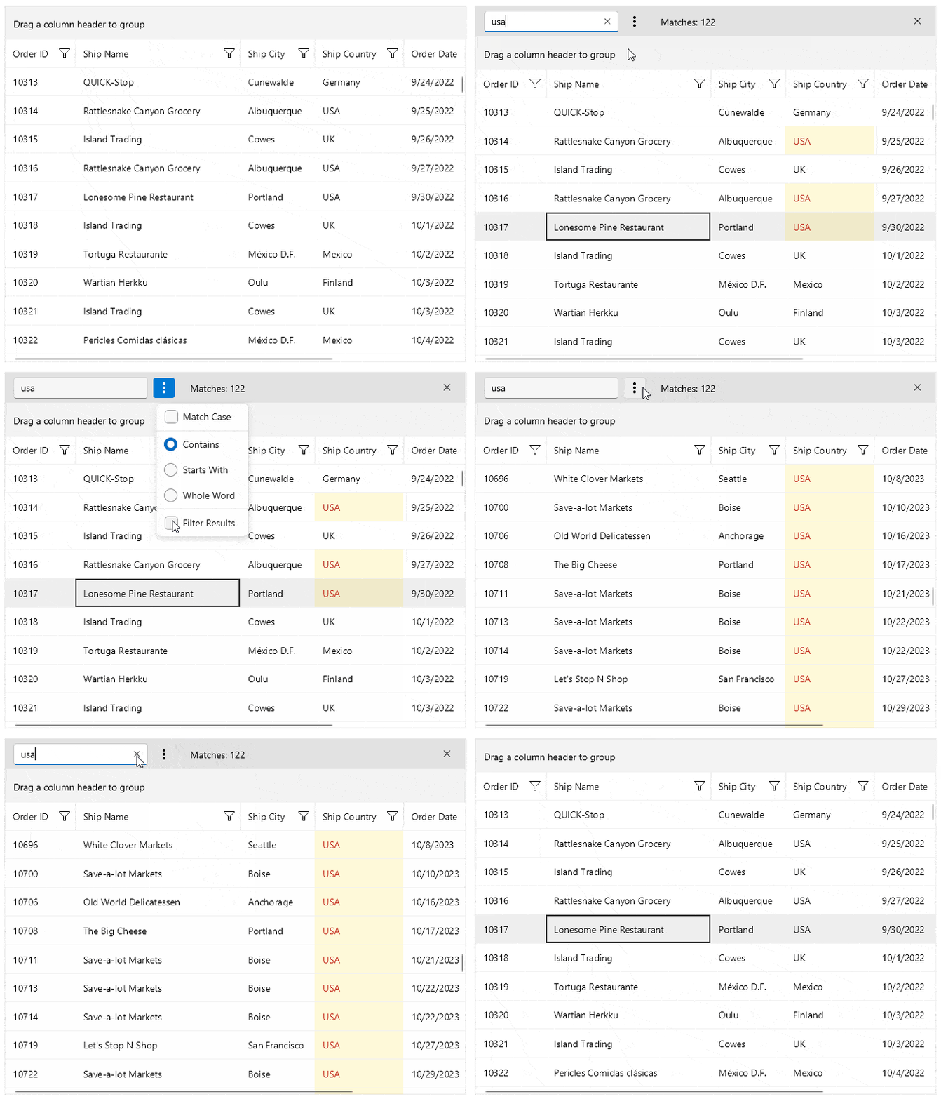
With 2024 Q1 the .NET MAUI DataGrid component provides the ability to search for specific data by using a configurable built-in search functionality, represented by a search panel UI.
You can control when to show the search panel as well as configure the way the search is performed and change the default behavior – search as you type. The search panel lists search options such as whether to match the case, or whether to filter the results, etc.
The .NET MAUI DataGrid provides customizable highlighting of the search results. Note that the matched chunks of text are also highlighted to make them easily noticeable.
See the .NET MAUI DataGrid documentation: Search as you type
PDF Viewer Improvements: Selection Support with Customizable Context Menu
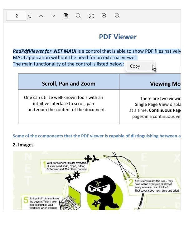
The .NET MAUI PDF Viewer component now provides a text selection functionality and enables users to mark and highlight a portion of the text.
On mobile devices, the selection is initiated after pressing and holding the target text and using the two drag handles to modify the current selection. For desktop devices, the text selection is initiated through a mouse click, while dragging extends the current selection.
Once a user selects a portion of the text, they will see a customizable selection menu with a default Copy command to allow them to retrieve the selected text.
See the .NET MAUI PDF Viewer documentation: Selection
.NET MAUI Scheduler: Built-in Dialogs
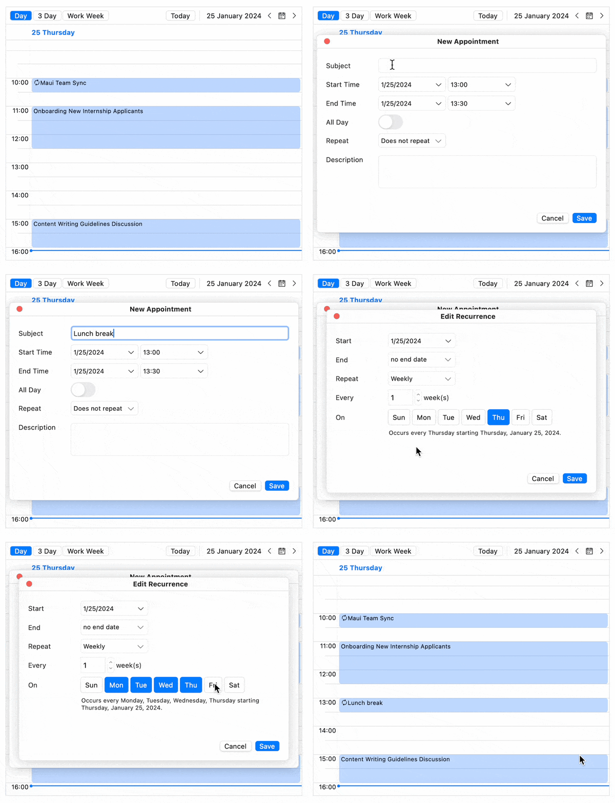
With 2024 Q1 the .NET MAUI Scheduler component comes with built-in customizable dialogs that will enable users to directly schedule their meetings inside the application within a few clicks. The Scheduler component now features the following dialogs:
- Preview Appointment Dialog
- Edit Appointment Dialog
- Edit Recurrence Dialog
- Edit Recurrence Choice Dialog
- Delete Recurrence Choice Dialog
- Delete Appointment Choice Dialog
See the .NET MAUI Scheduler docs: Built-In Dialogs and
.NET MAUI Scheduler: Custom Date Formats
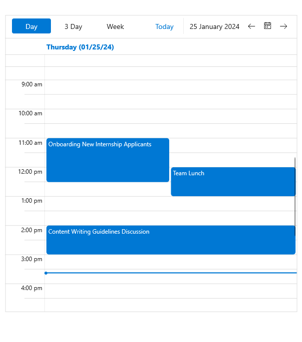
Another Scheduler improvement is the built-in date formatting support. Now you can customize each Scheduler view to use custom formats for displaying dates and times on the time ruler and in the headers.
See the .NET MAUI Scheduler docs: Custom Date Formats
RichTextEditor: Customizable ContextMenu
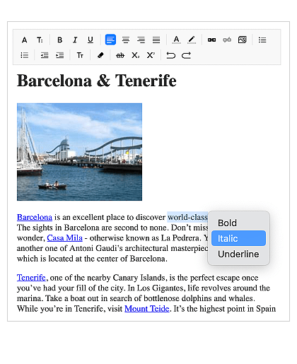
The .NET MAUI RichTextEditor comes with a built-in context menu. Users will find this helpful to perform operations, such as “Select All”, “Cut”, “Copy”, “Paste”, and move content between apps or within an app.
For desktop, the context menu opens on a right-button click over the editor's content. On Android and iOS, it appears as soon as the user performs selection.
You can modify the default context menu and add or remove some of the provided options or set your own custom options.
See the .NET MAUI RichTextEditor documentation: Context Menu
Multiple Document Processing Libraries (DPL) Improvements
- Font subset embedding in PDF for .NET 6+ : The PDF library now supports controlling if the whole TrueType font or only a subset of the used characters gets embedded in the resulting document. This makes the document portable and at the same time with optimal file size.
- OTF font file format support: Our PDF library now supports OpenType font format (OTF) which is widely used and combines the features of PostScript and TrueType font formats.
- New online demo application: This dedicated DPL asset exposes many common scenarios where the libraries can help along with full code snippets.
- All document processing libraries now only support .NET Framework 4.6.2 and above, and .NET 6 and above.
Telerik UI for .NET MAUI - 2024 Q2
- Telerik UI for .NET MAUI AIPrompt: Blending AI with UI
- New Component: .NET MAUI CollectionView
- New Component: .NET MAUI TemplatedButton
- New Component: .NET MAUI ToggleButton
- Grid upgrade: New DataGrid SKIAColumn
- New Component: .NET MAUI Slider
- .NET MAUI DataGrid Enhancement: Search as You Type
- PDF Viewer Improvements: Selection Support with Customizable Context Menu
- .NET MAUI Scheduler: Built-in Dialogs
- .NET MAUI Scheduler: Custom Date Formats
- RichTextEditor: Customizable ContextMenu
- Multiple Document Processing Libraries (DPL) Improvements
New features & Roadmap
Have a feature request?
Post your feedback via the Feedback Portal or the Public forums
What's new across all Telerik products?

Get the Bits
Download Free TrialSee Telerik UI for .NET MAUI in action and check out how much it can do out-of-the-box.


