Kendo UI for jQuery
jQuery DropDownTree
- The easiest way to show hierarchical data in a drop-down tree of selectable options.
- Part of the Kendo UI for jQuery library along with 120+ professionally-designed components.
- Includes support, documentation, demos, virtual classrooms, learning resources and more!
-
Overview
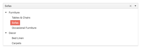
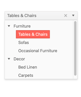
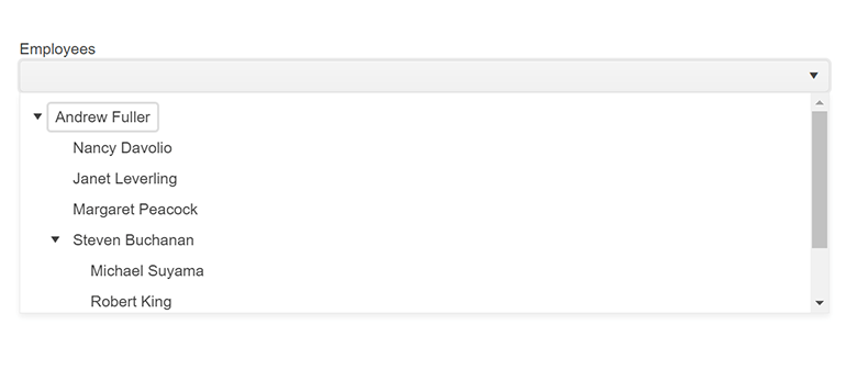
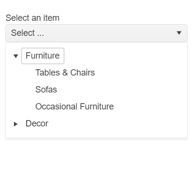
The Kendo UI for jQuery DropDownTree is a form component that renders data in a tree-like structure within a DropDown component. The user can click the dropdown and then choose a single predefined value. It is a richer version of the <select> HTML element and supports data binding, filtering and templates.
-
Data Binding
The jQuery DropDownTree enables you to bind it to various forms of data, including datasets of complex items (objects) or an array of primitive items. Data can be locl or remote. As a part of this binding, fields can be defined to represent the text displayed to the user as well as a separate underlying value to be used by developers.
-
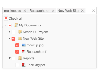
Checkboxes
Give users an intuitive way to select multiple items with checkboxes. When a box is checked, the selected item will populate in the field and will be accompanied by a “delete” icon.
-
Adaptive Mode
The jQuery DropDownTree UI component supports an adaptive mode that provides a mobile-friendly rendering of the component popup. When enabled, the component will automatically adapt to the current screen size and will change its rendering accordingly.
-
Filtering
Help users narrow their list and find items by allowing them to filter. With this feature enabled, a filter box will appear at the top of the list and the list will be narrowed as characters are typed.
-
Floating Label
Save space without losing the context of the form field with the DropDownTree floating label feature. Ensure a smoother and more efficient experience for end-users by adding a label that moves above the input upon clicking.
-
Templates
Out of the box, the Kendo UI for jQuery DropDownTree renders items as plain text. You can utilize templates to create a custom layout for each element, including the list items, the list value, the header and footer areas, as well as the message displayed when no data is connected to the DropDownTree.
-
Keyboard Navigation
Improve accessibility and productivity with keyboard-only navigation. This component supports keyboard navigation to help navigate and interact with items.