KendoReact
Free React TabStrip
- Easily create a customizable tabbed interface that automatically inherits your React application's theme.
- Part of the KendoReact library along with 120+ free and paid enterprise-grade UI components.
- This component is free to use, including in production—no sign-up or license required!
-
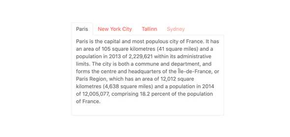
Organize Content Info Customizable Tabs
With the React TabStrip component you can display a collection of tabs each with its own associated content. Users can easily navigate between tabs via mouse or keyboard, and each tab comes with several configuration options for how users can interact with it.
-
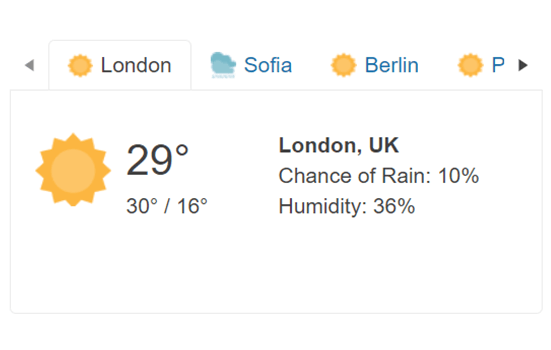
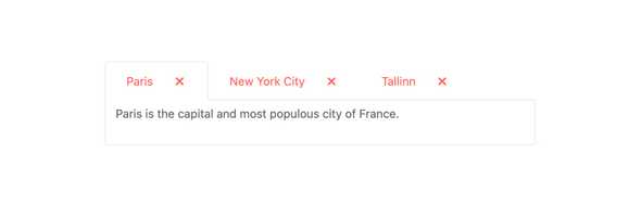
Tabs
Each tab within the KendoReact TabStrip component comes with multiple configuration options. This includes setting the text of the tabs, displaying or not displaying tabs on initial loading, setting the tab position, as well as implementing closable tabs.
-
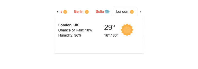
Scrollable Tabs
When the space your tabs occupy is greater than the width of the container, your layout can become unpleasant. To avoid this, the KendoReact TabStrip will automatically add scroll controls. Your layout will be intact, and your users will be pleased.
See the KendoReact Scrollable Tabs demo

-
Right-to-Left Support
The KendoReact TabStrip component RTL mode enables you to display the control’s text and UI elements from right to left.
-
Keyboard Navigation
Every tab within the KendoReact TabStrip can be navigated to and interacted with using keyboard navigation, ensuring users can interact with the React component no matter which method they need to use.
-
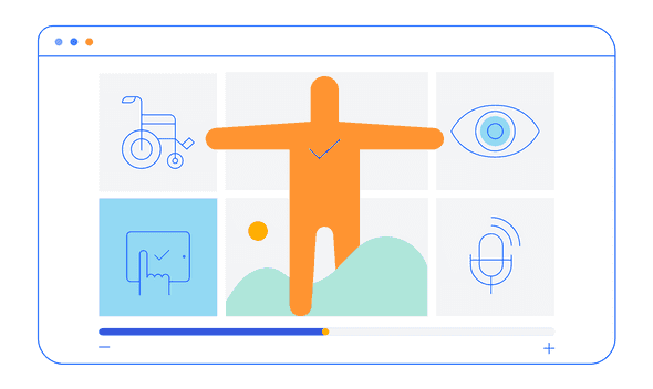
Accessibility
The KendoReact TabStrip is fully accessible and has built-in compliance for Section 508 and WAI-ARIA standards, and has a AAA rating for WCAG 2.0.